
Highlight Key Information in Screenshots
Use PixPin Spotlight to highlight key information in busy screenshots, reduce visual clutter, and create clearer bug reports, design reviews, and tutorials.
 Image Annotation
When explaining something with a screenshot, you may find that the important area is already marked, yet the text is too small, the icons are too tightly packed, or the state change is too subtle. Readers still have to lean in to see it, so communication remains inefficient.
PixPin’s magnifier annotation is ideal for these situations. It enlarges a specific area of a screenshot and uses a connecting line to link the enlarged view to its original position. Readers can tell at a glance which detail you want to emphasize and immediately see its contents clearly.
If you are searching for how to magnify part of a screenshot, how to use a screenshot magnifier tool, or how to configure PixPin magnifier annotations, this guide explains the essential workflow and how to choose the right settings.
In design reviews, issue reports, and feature tutorials, critical information is often concentrated in a small area, such as:
If you rely only on arrows, borders, or written explanations, readers may know where to look without immediately seeing what is happening there. The problem becomes even more noticeable when a screenshot is scaled down in a chat window, document page, or ticketing system.
A magnifier annotation lets you identify the point of interest and reveal its detail in the same visual. This makes it especially useful for screenshots of dense interfaces, small controls, and subtle state differences.
A PixPin magnifier annotation is a tool for enlarging a selected area. First, select the target area in the original image. Then display that content at a larger scale and choose its shape, border, connecting line, and visual effects.
Compared with a standard border, a magnifier is better at emphasizing detailed content. Unlike cropping out part of a screenshot, it preserves the full context, making it easier to understand where the enlarged area came from. And compared with a long standalone explanation, it communicates the point more directly.
Common adjustable magnifier settings include:
Together, these settings cover most situations where you need to magnify part of a screenshot.
Design reviews often involve discussing corner radii, strokes, spacing, font sizes, and button states. Many issues are confined to a small area. Adding a magnifier annotation makes the item under review clearer and keeps the discussion focused.
When you submit a bug, developers usually need to see exactly how the problem appears. Magnifier annotations work well for highlighting incorrect copy, misaligned elements, truncated text, unusual colors, and status icons.
In a feature guide, users often need to see the precise location of a toggle, menu item, or icon. Enlarging the entry point makes the instructions easier to understand.
When you need to tell a customer, tester, product manager, or operations teammate to look closely at a detail, a magnifier annotation brings everyone to the same point of discussion faster and reduces back-and-forth clarification.
To quickly create a screenshot with an enlarged detail, follow these steps:
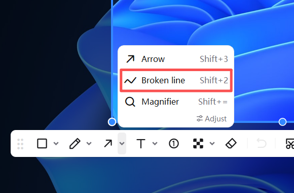 PixPin Magnifier tool
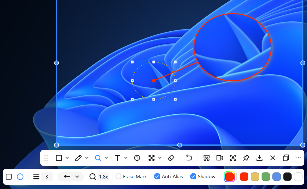 Magnifying an area of a screenshot
PixPin magnifier annotations support both rectangular and circular shapes. Your choice directly affects how readers perceive the highlighted detail.
A rectangle is better for enlarging structured interface elements such as input fields, buttons, table cells, menu items, notification bars, and complete settings areas. These elements already have clear horizontal and vertical structure, so a rectangular magnifier feels more stable and preserves their full boundaries more easily.
A circle is better for emphasizing a single detail, such as a status icon, a small button, a changing value, or an isolated visual issue. Its focused shape naturally draws the reader’s attention toward the center.
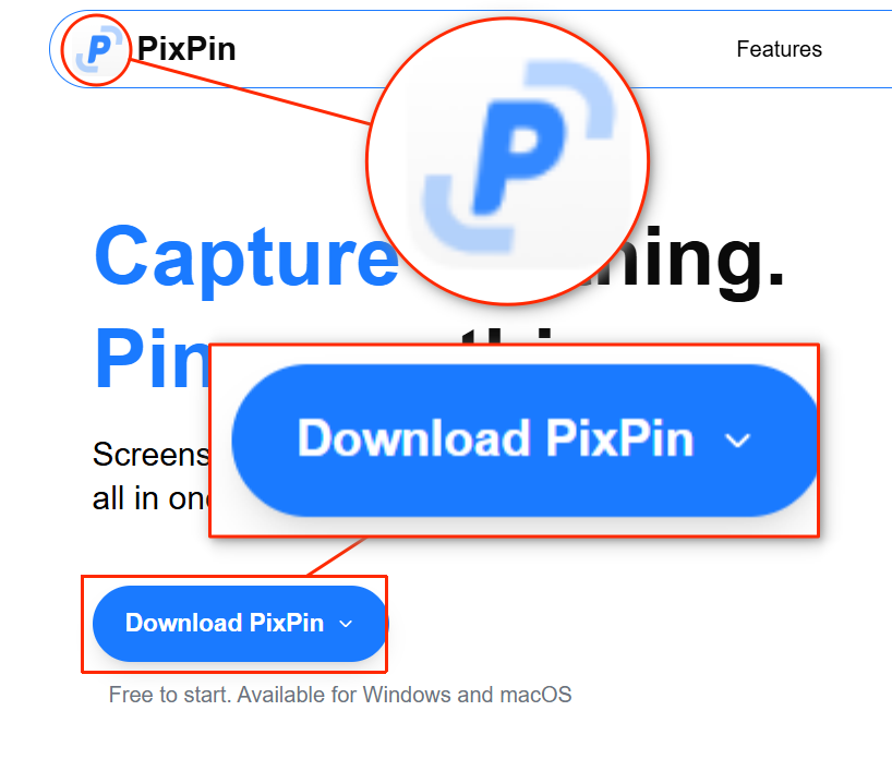 Difference between rectangular and circular magnifiers
The border width determines how strongly the enlarged area stands out. If it is too thin, the magnifier may blend into the background. If it is too thick, the image can feel visually heavy and the detail itself may become harder to read.
As a general guide:
If there are already many annotation elements around the magnifier, start with a medium border and adjust from there. This makes it easier to balance emphasis with a clean composition.
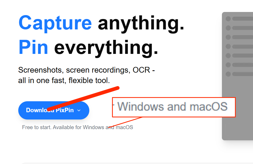 Effects of different magnifier border widths
The connecting line helps readers quickly understand the relationship between the location in the original image and the enlarged area. This is particularly important for someone seeing the screenshot for the first time.
In PixPin’s magnifier tool, you can choose a connecting-line style or hide the line entirely.
For polished product documentation or tutorials, choose a simple, restrained connecting-line style. For bug reports or feedback, a more prominent style can make the relationship easier to follow. The guiding principle is simple: readers should spend as little time as possible working out what connects to what.
The magnification factor determines how much a small detail is enlarged. If it is too low, readers still cannot see the content clearly. If it is too high, the content can feel cramped and readers may lose their sense of the overall structure.
A reliable approach is to enlarge the text or icon until it is recognizable at a glance, then decide whether any further magnification is necessary.
Use these guidelines for common situations:
In a bug report, the goal is to make the problem clearly visible. In a tutorial, the goal is to show users exactly where to click. Both require clarity, but neither benefits from maximizing the magnification factor without a reason.
PixPin lets you control whether other annotations appear inside the magnified area. This option is useful because different situations call for very different amounts of information.
If the content inside the magnifier already explains the issue, hiding other annotations usually produces a cleaner result. If you need to preserve an action sequence, directional cue, or conclusion, showing the other annotations is more appropriate.
The Magnifier tool’s Smooth and Pixel modes control how enlarged pixels are rendered, while shadows affect how clearly the magnified area stands apart from the background.
Smooth mode softens pixel edges in the magnified area. The effect is especially visible around circular magnifiers, diagonal icons, and high-contrast edges, so it usually works well for screenshots sent to customers, used in tutorials, or included in formal documentation.
Pixel mode preserves hard pixel boundaries and is better suited to pixel art, bitmap assets, or pixel-level inspection. Choose the mode that keeps the detail clear and matches the style of the original image.
A shadow makes the magnified area stand out more clearly from the background and creates a stronger sense of depth. It is particularly helpful when the background is complex, the colors are similar, or the page contains many densely packed elements.
If the screenshot is already very clean, or you prefer a flat and crisp presentation, reduce the shadow or disable it entirely.
Placing it too far away increases the reader’s effort, especially when there is no connecting line. Unless the layout leaves no other option, position the enlarged area near the target.
If a screenshot contains too many magnifiers, readers have to switch repeatedly between several enlarged areas, which reduces comprehension. One primary magnifier usually works best; two or three should be the upper limit.
Use the magnifier to enlarge details, arrows to point to locations, and text to add context or conclusions. Giving each annotation type a clear role makes the image easier to follow.
Shapes, borders, connecting lines, and shadows are supporting elements. What matters is whether readers can understand the detail quickly. If an effect makes the information more complicated, return to a simpler setting.
| Tool | Best use | Typical scenarios |
|---|---|---|
| Magnifier annotation | Enlarge a small detail while preserving the context of the original image | Design reviews, bug reports, and tutorial screenshots |
| Border | Mark the boundary of an area or module | Settings sections, cards, and form areas |
| Arrow | Point to a location, direction, or point of change | Feature entry points, process instructions, and visual issues |
| Text annotation | Add conclusions and background information | Explaining the cause of an issue or required action |
If your goal is to help readers see detailed content clearly, a magnifier annotation is usually the most direct choice. If you need to outline an area, emphasize a direction, or add a conclusion, borders, arrows, and text annotations are more suitable.
Magnifier annotations work best for small text, tightly packed icons, subtle state differences, and isolated visual issues that are hard to see. Examples include button states, error messages, field values, icon changes, and fine design details.
It depends on the content. Rectangles are better for structured interface elements, while circles are better for a single detail or isolated visual issue. The right choice is whichever makes the content easiest for readers to understand.
No. If the enlarged area is close to the target and readers can easily understand the relationship, hiding the connecting line creates a cleaner image. If the original image contains many elements, keeping the connecting line is usually the safer choice.
No. A magnification factor that lets readers see the content quickly is enough. Increasing it further may make the enlarged view feel crowded and weaken the reader’s sense of the full layout.
Show them if they help explain a step, sequence, or conclusion. If they distract from the main content, hiding them usually makes the detail clearer.
Smooth mode works best for most interface screenshots and documentation, while Pixel mode is better for pixel art or pixel-level inspection. Shadows are helpful on complex backgrounds but optional on a clean interface.
The easiest parts of a screenshot to overlook are often the small details that determine how the whole image is understood. PixPin magnifier annotations bring those details directly into view while preserving the context of the original screenshot, making communication more efficient.
If you regularly conduct design reviews, report issues, create feature tutorials, or communicate with a team, learning how to choose rectangular and circular shapes, border widths, connecting lines, magnification factors, annotation visibility, Smooth or Pixel mode, and shadows will help you create clear magnified callouts for most screenshot workflows.
If the content in your screenshot is not small but is getting lost among too much information, continue with Highlight Key Information in Screenshots. To review every magnifier setting, see the PixPin Magnifier documentation.
Related posts
 Image Annotation
Use PixPin Spotlight to highlight key information in busy screenshots, reduce visual clutter, and create clearer bug reports, design reviews, and tutorials.
 Capture Guides
Learn how to take a screenshot on a Windows 11/10 PC or Mac. Compare the main shortcuts, steps, save locations, and PixPin capture tools.
 Capture Guides
Learn how to pin a screenshot or image on screen with PixPin, resize it, keep it always on top, lock it, or restore it from pin history.