
How to Magnify Screenshot Details
Learn to magnify screenshot details with PixPin using the right shape, border, connecting line, magnification factor, Smooth or Pixel mode, and shadow.
 Image Annotation
When explaining something with a screenshot, the most common problem is not a lack of annotations. It is adding so many annotations that the viewer still cannot understand the point. If buttons, text, tables, alerts, and sidebars all appear in the same image, arrows, boxes, and text labels alone can still leave readers searching for what matters.
That is when PixPin’s Spotlight tool works best. It brings the area that deserves attention into clear focus. In this article, highlight describes what Spotlight does; Spotlight is the PixPin feature name. Instead of adding more elements, the tool first tones down irrelevant information and then emphasizes the exact area you want to explain.
When people first annotate a screenshot, they often reach for arrows, rectangles, and text labels. There is nothing wrong with these tools, but on a screenshot packed with information, new problems emerge:
The real purpose of screenshot annotation is not to prove that you marked something. It is to help the other person understand your message within seconds. When a screenshot has many potential points of interest, the first step is usually not to add another annotation, but to establish a clear visual focus.
PixPin’s Spotlight tool is designed for screenshots where the full image contains a lot of information but only one small area truly matters. It keeps the selected area visible while dimming the surrounding content, naturally guiding the reader’s eyes to the point you want to emphasize.
Compared with a standard outline, Spotlight works better on complex interfaces. Unlike an arrow alone, it communicates a more immediate message: “Look here first.” In this guide, highlighting an area means using Spotlight to draw attention to it, not selecting PixPin’s separate Highlighter tool.
In addition to highlighting an area, PixPin’s Spotlight tool lets you add an outline around it and adjust the outline’s width and color. This is useful because the Spotlight effect alone is not always enough. In some screenshots, you may also need to define the exact boundary of the focal area or visually distinguish different types of issues.
Design mockups and live pages often contain many visual elements at once. Spotlight isolates the button, card, or heading that needs revision, so everyone in the review can find the relevant area without scanning the entire image.
When reporting a bug, the last thing you want is for a developer to miss the location of the problem. Forms, admin dashboards, and list pages can contain many modules in one screenshot. Highlighting the affected area first and adding one short note is often more direct than drawing an arrow alone.
Product tutorials frequently need to tell users where to click next. When the interface contains many elements, highlighting the target control is easier to understand than a long paragraph and reduces the time readers spend switching between the instructions and the screenshot.
Whether you are explaining a process to a customer or confirming the location of a change with your team, highlighting helps everyone align quickly. This is especially useful in cross-functional communication: spotlight the important area first, then add one concise explanation.
To quickly emphasize the key information in a screenshot, follow these steps:
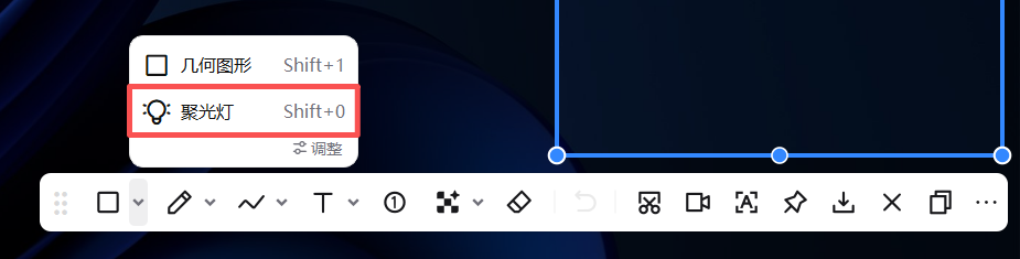 PixPin Spotlight annotation tool
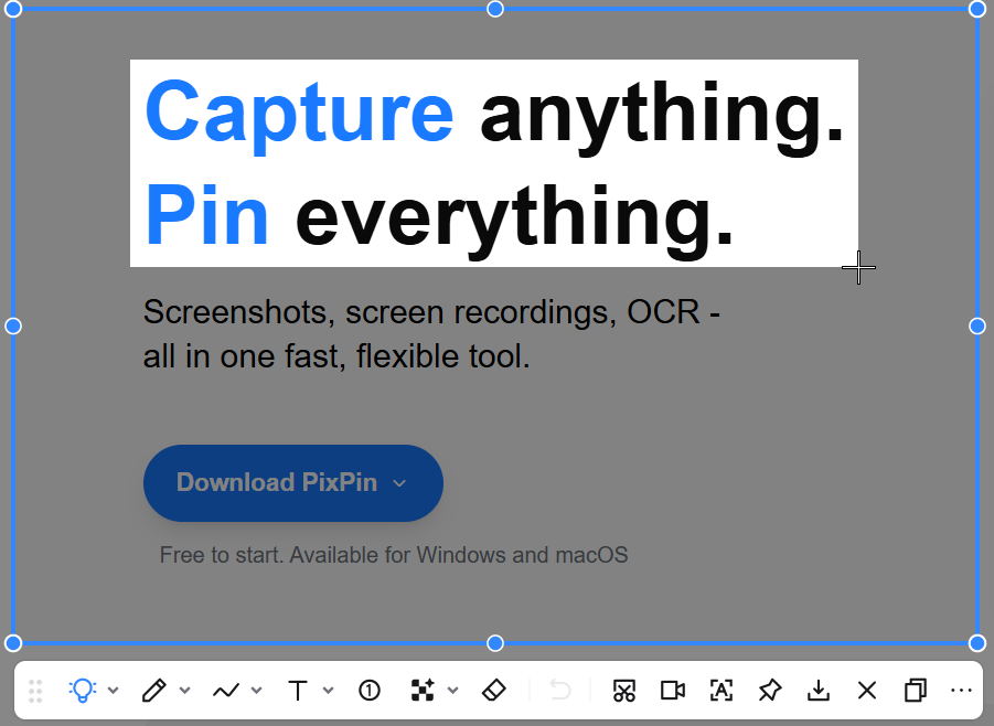 Selecting the area to highlight
If you have already added many annotations and the image still feels cluttered, the problem is usually not a lack of tools. The visual hierarchy is still unclear. First decide, “What is the single most important message in this image?” Then determine whether a second Spotlight area is truly necessary.
Add an outline to a Spotlight area when the Spotlight effect is visible but its boundary is still unclear. An outline is especially effective when the background contains complex colors, the focal area touches nearby elements, or you need to emphasize a complete module rather than a single point.
Think about outline width this way:
Outline color is particularly useful for distinguishing categories:
Remember that the purpose of an outline is to make the focal point clearer, not to make the screenshot more decorative. An overly vivid color or excessively thick outline can compete with the highlighted area for attention.
Some buttons, input fields, or alerts already use colors similar to the background, so highlighting them may still not be noticeable enough. Adding an outline makes it clear exactly where the area of interest begins and ends.
If you are explaining a complete settings section, information card, dialog, or form module, an outline works better than highlighting a single point. In this case, you are emphasizing the whole block of content rather than one control.
Admin dashboards, design mockups, and data panels may contain many colors and interface elements, which can interfere with the Spotlight effect. An outline creates a clear boundary and keeps the focal area from blending into the surrounding interface.
In a design review, for example, one color could represent a visual hierarchy issue and another an interaction issue. In a bug report, one color could identify the defect while another shows its impact area. Outline colors work well as category markers in these situations.
If you highlight three or four areas in the same image, readers may still be unsure where to look first. A more reliable approach is to choose one primary focal point and retain everything else only as supporting context.
When a highlight covers too much of the screenshot, its message becomes “everything here is important,” which effectively means there is no focal point. In most cases, limiting the highlight to the target button, field, alert, or module makes the annotation easier to understand.
If you need to highlight a relatively large area and worry that its boundary will be unclear, add an outline. This preserves the visual focus created by Spotlight while defining the area’s scope more precisely.
A Spotlight selection answers “Where should I look?” while text answers “Why should I look here?” One short note is often enough, such as “The Save button is showing the wrong state” or “This option should be enabled by default.”
If you genuinely need to explain several areas, use numbers to show their order. If the issue itself is complex, splitting it across two or three screenshots is often more effective than packing every focal point into one image.
| Tool | Best use | Typical scenarios |
|---|---|---|
| Spotlight | Emphasize the primary focal point in a complex screenshot | Design reviews, bug reports, tutorial instructions |
| Arrow | Point to a location or direction of change | Identifying an entry point, process flow, or error location |
| Box | Define an area or module | Enclosing a region, component, or content block |
| Text annotation | Add context and conclusions | Explaining why something is a problem |
If your goal is to make someone look at a specific area first, start with Spotlight. If you need to explain what changed there, combine it with an arrow and brief text for a more complete message.
No. Spotlight dims the area around a selection, while the Highlighter applies marker-like color directly over content. Use Spotlight to isolate a region; use the Highlighter to mark text or other details.
Yes, but avoid highlighting too many areas from the start. One primary focal point and no more than two or three secondary points usually keeps an image readable. If you have many points to show, splitting them across multiple screenshots is generally clearer than stacking more annotations onto one image.
Often, yes. A highlight attracts the reader’s eye, while arrows and text provide context. Used together, they help readers find the focal point quickly and immediately understand the problem or conclusion.
Enable the outline when the boundary of the focal area is unclear, the background is visually complex, or you want to emphasize an entire module rather than a single button. For a subtle visual cue, the highlight alone is often sufficient.
When a screenshot contains too many potential focal points, the main problem is not a lack of annotation tools but a lack of clear visual priority. PixPin’s Spotlight tool helps you bring the truly important area forward, then communicate your message with as little additional explanation as possible.
If you regularly create design reviews, bug reports, step-by-step tutorials, or cross-team updates, this approach saves time and makes the key information immediately clear compared with relying on arrows and boxes alone.
If the focal point is already clear but its text or icon is too small, read How to Magnify Screenshot Details. For general annotation controls and shortcuts, see the PixPin annotation basics documentation.
Related posts
 Image Annotation
Learn to magnify screenshot details with PixPin using the right shape, border, connecting line, magnification factor, Smooth or Pixel mode, and shadow.
 Capture Guides
Learn how to take a screenshot on a Windows 11/10 PC or Mac. Compare the main shortcuts, steps, save locations, and PixPin capture tools.
 Capture Guides
Learn how to pin a screenshot or image on screen with PixPin, resize it, keep it always on top, lock it, or restore it from pin history.